2/21/13

Tension and Tears: Holocaust Memorial by Peter Eisenman

Arial Perspective: Getting lost in your emotions

 Tension and Tears


Placed in the center of Downtown Berlin, Germany is the “Memorial to the Murdered Jews of Europe” to honor the life and death of the victims of the genocide which was the Jewish Holocaust of the 1930’s and 40’s. In 1998 an architectural competition was held and Peter Eisenmans design was selected from a pool of well-known architects, however the project wasn’t finished and dedicated until 2005. Before the project was completed there were years of controversy for its banal and undecorated design. After the projects dedication most of those controversy’s diminished, however architecture like this is experienced best through an open mind and unbiased opinions.  

I chose to focus on this project because of its strong, yet simple use of emotion and unsettled wonder. Designed to be a space of tension from the normal everyday world, this project allows the user to walk through a maze of solid rectangular concrete slabs, weaving through a grid of both the unknown and the interesting. Tessellated in height these volumes act as a “wave” in elevation as they cross a sloped terrain, gradually changing the perspective of the nearest juxtaposed slab. An area of interstitial movement which doesn’t try to be a representative form or museum, yet a space of complete emotion where the user is left to convey their own feeling as they pass through. Unlike most memorials which highlight the names of the victims or hero’s, the “Memorial to the Murdered Jews of Europe” leaves a bare finish to the volumes, highlighting only the strange sensation of disappearing into a space where you feel you most uncomfortable. 

While I have never personally experienced this space, I would most certainly make an effort to visit if I were in Berlin. The idea of a space taking you into a place where you are stripped of your comfort is spot-on in my mind, for conveying the emotion which respects and resembles a dark moment in history such as the holocaust.  

Sketch: "Unknown destination"


3D Cutting:
"Walking Through Unadorned Field of Volumes"


Interrupted Paths: Effects of the Berlin Wall


The Berlin Wall was constructed in 1961, nearly 16 years after the fall of the Nazi regime. It was constructed as a barrier between Soviet-occupied East Berlin, and the former territories of USA, Great Britain, and France, which made up West Berlin. Immigration from East Berlin to West Berlin had grown exponentially in the years leading up to the construction of the wall, although the official title of the wall was “Anti-Fascist Protection Rampart.” Construction occurred nearly overnight, cutting off the border between East and West Berlin in such a swift, aggressive way that entire neighborhoods and once bustling thoroughfares were abruptly stifled.


It is this closure of path that interests me. The idea that what was once a way to travel through a space could so quickly change to a barrier must have completely changed the way that space was used. An intersection may become a dead-end, or a piazza may become a narrow alley. It was not merely a single obstacle blocking a path, but an entirely new edge, redefining the boundary of an entire city.
I created a few sketches to illustrate my idea of this closure of path, and converted those sketches into a paper cut-out model. I depicted a series of doorways shown in a perspective view, continuing into the distance. These doorways have a mirror-image counterpart directly in front of them to suggest moving through these double entryways into another space, or the same space. However, these mirrored doorways are separated by a large, blank wall that runs between them along the entire length of the rows of doorways. Not only does this wall obstruct the movement through one doorway and into the next, but it creates an entirely new path in the interstitial space between these doorways. This same effect must have occurred when the Berlin Wall itself was constructed. It closed paths between doorways and forced users to use the route along the wall, or turn back in the direction from which they came. No forward movement was possible.

Erich Mendelsohn - Petersdorff Department Store


          At the turn of the 20th Century, the Modern Architecture movement began to take hold. This movement would attract many famous architects such as Frank Lloyd Wright, Le Corbusier, Walter Gropius, and Mies van der Rohe. In the early part of the Modern Architecture Era, Expressionism began to develop in Northern Europe. The Expressionist style adopted some of the characteristics of Modernist Architecture.

          The Petersdorff Department Store building is a great example of this blending of Expressionism and Modernism. Built in 1928, the building contains layers of brick and glass stacked on top of each other. Mass production of brick, steel, and glass allowed for more possibilities in architecture and structure, and allowed the expressionists to create interesting organic forms. This is evident in the façade of the store which is created by a large overhanging structure that bends itself around the corner of the two adjacent streets.


          I like how the use of the steel and glass in the structure seem to make the brick layers float on top of each other. The streamline look of the building is also interesting as it makes the front façade seem longer than it actually is.

          In my drawing and cutting of the building, I focused on the façade of the building and the vertical layering of the structure.


2/20/13

Daniel Libeskind's Jewish Museum

            The new addition to the Jewish Museum in Berlin was completed in 2001 by famed architect Daniel Libeskind.  The building itself is a testament to the hardships that the Jewish population faced under the reign of Hitler, and the plan of the building was developed by warping the Star of David.  It sits on land that used to be part of West Berlin before the Berlin Wall was in place.  The only public entrance to the new addition is actually through an underground tunnel coming from the existing building.  This form of entry was intended to evoke emotion out of the user almost immediately, and to set up an expectation for what kind of space was to come.

One of the most interesting things about Daniel Libeskind's addition to the Jewish Museum is the manner in which he used voids in the skin to create shadows within the interior spaces.  At first glance the voids may seem sporadic, but there is a definite meaning to their pattern, and the spaces within greatly benefit from the kind of shadows created by these voids.  Libeskind intended the spaces within to make the visitor feel empty and to create a sense of absence throughout. 

I chose to focus on the concept of these voids and how they create meaningful shadows within the spaces.  The room I represented in my model is a small exhibit space that shows just how effective the shadows are at affecting the feeling of the space.  The voids not only create a zigzag pattern on the walls, they relay that pattern to the floor as well, which in my opinion makes the spaces quite interesting.  


Exterior Shadows


Interior Shadows

Voids 


Sketch showing the voids in the exhibit space

Fabrication plan


Exemplary Neoclassicism: The Altes Museum, Berlin, Germany

As an architecture student in the 21st century, I seem to take for granted ancient civilizations and architecture that is now so readily accessible. Until I began to study architecture, it did not occur to me that entire cities such as Pompeii and Herculaneum were hidden treasures that were only uncovered by accident in the 18th century. The discovery of these ancient cities led western Europe into an age of Enlightenment in which ornamental decorative styles were replaced with the classical sincerity of antiquity. Rococo frivolity was exchanged for the simplicity of Greek and Roman styles and the Bourgeoisie was convinced that it was returning to the truth of the ancients. The Grand tour led young men to travel Europe and experience these antiquities as part of their aristocratic education. With the revival of Plato's ideas, these young artists and architects sought to imitate the beauty of the ancients. One of these young architects was Karl Friedrich Schinkle. In 1822 at the height of Neoclassicism, his design for the Altes Museum in the Berlin exemplified the neoclassical ideals of the time and set the typology for museums in generations to come. 

Schinkle was a Prussian born designer during the Neoclassical period. He traveled throughout France and Italy extensively, seeing the discovery of ancient cities first-hand. In 1822, he was commissioned to design the Royal Museum in Berlin by King Friedrich Wilhem III. The purpose of the new museum was to share the Royal collection with the public as to educate them in the arts. The facade of the museum consists of columns in the Ionic order, creating a portico in front of the entrance into the main atrium. In contrast to the continuity of the columns in ancient temples, the ionic columns stop at the front facade. The remaining facades are simple planes out of brick, emphasizing the entrance. Since the museum was built on a plinth to evade floods and moisture damaging the artwork, the ceremonial steps in the front create the visual and physical connection needed to enter the museum. 


In section, the double story dome was modeled after the Pantheon to allow light to enter the atrium. However, it was encased in a rectangular shape so it would not compete with the Berliner Dom Cathedral. 


In plan, the circular atrium beneath the dome recalls the use of a central plan in many Palladian Villas with the galleries creating the circulation around the atrium. The layering of the fluted ionic columns encase the precious works within, reminiscing on the glory of antiquity. 

The monumentality of the museum's design was scaled down in comparison with its Roman and Greek counterparts. Instead of building a temple for a god, he designed a temple for the work of men. Nevertheless, Schinkle remained true to the influence of the Greeks and Romans. He interpreted the ideals of the ancients to his own time.  However you look at it, it is the perfect example of the revival of classical orders. 


(sources: http://www.greatbuildings.com/cgi-bin/gbi.cgi/Altes_Museum.html/cid_altes_rh_001.html)

The Neues Museum- Old vs. New


Nothing communicates the contrast between old and new more beautifully than the Neues Museum in Berlin, Germany. Because while this building exhibits the contrast between both elements, it simultaneously seams the two together. The structure, built in 1841-1859, was designed by Friedrich August Stuler. However, it suffered a great deal of damage in the bombing of Berlin during World War II, which left the building unfit for use. Finally in 1997, David Chipperfield won the design competition for the museum’s restoration, and in 2009, the building once again open its doors to the public.
The concept behind the renovation was to maintain the existing structure and fill in the gaps with architecture that would respect the building’s history and original intent. Arch Daily says, “The original structure should be emphasized in its special context and original materiality—the new reflects the lost without imitating it.” Chipperfield created new space without overshadowing the existing and without duplicating what was destroyed. He emphasized the old ruins by contrasting them to his contemporary elements.
In this model, I aim to show the conflicting entities of old and new. The white paper represents the old structure, aged and in disrepair, enveloped in the sleek black paper, representative of the new architectural construction. Even though the black covers the white, both have their place. The black exterior molds to the structure of the white, creating a new skin but maintaining the previous form. The white is still present and evident in the interior, preserving the building’s history and former glory. 


The Malleable Memorial


The Holocaust Memorial in Berlin designed by Peter Eisenman has become an iconic and emotional project in the past few years.  The memorial was completed in December of 2004 and was dedicated in May of 2005. Thousands of concrete slabs span a massive area of 19,000 square meters and are placed in an organized grid pattern.  
Although I have not personally visited this site yet, it looks as if the space is extremely dynamic in that it changes based on the time of day, season, weather conditions, sunlight, etc.  In addition to these aesthetic changes, the change in scale is also very intriguing. My analyses include two different views of the memorial: one from an aerial perspective and another from the human experience.  From the aerial view, the space takes on a rippling, textured skin effect that is more seamless.  From the scale of the average person, the blocks seem more massive and the pattern more maze-like.  It is interesting how malleable this space is based on aspects like scale. 
Textured skin from birds-eye
Detail of texture
VERSUS:

Human experience

2/19/13

Peter Eisenman-- Memorial to the Murdered Jews of Europe


Memorial to the Murdered Jews of Europe- Peter Eisenman

The first thing I noticed about the memorial located in Berlin was the ratio solid to voids.  The memorial appears very sterile and clean, while representing such an important topic in the history of Europe.  The sterility of the memorial left me with a frightened and somber feeling.  The intensity of the large concrete blocks successfully conveys the severity of the crime against the Jewish population. 

I also appreciated the design which incorporates a variety of heights in addition to a sloping plane.  The variety in elevation creates even more interest and, in my opinion, better represents the individuals that were killed as opposed to a mass. 

Many have been opposed to the design of the memorial in addition to the focus on only Jewish people. While I would not want to "hang out" in the memorial every day, it respects the people and creates the perfect atmosphere to seriously consider the crimes of the past. 

My cuttings below focused on the strong grid of the design.  the 1:1 ratio is very apparent in the memorial.  I studied the void in comparison to the raised concrete structures resulting in the forms below. 

plan view of grid system in memorial

comparison between block structures and the voids that they create

intense linear alignment of memorial

slight topographic change on site

2/18/13

Berlin Musikinstrumenten Museum


Hans Scharoun’s 1964 Kulturforum is a collection of multifunctional buildings that were designed to create engaging and multifunctional spaces that would interact with the existing architecture and landscape. One of the buildings in the collection that I found intriguing was the Berlin Musikinstrumenten Museum located behind the Philarmonie.  The Museum was completed in 1984 and the exterior was designed to show the influence of historical musical instruments. The facades combination of curves and sharp angles give depth to the design and allow light to enter in many different ways.  I particularly liked the right side of the building because of the different sized triangular peaks that contrast with the curves of the left side. The simplicity of the lines creates intriguing shadows against the rest of the building. Unlike many of the other traditional buildings I have seen throughout Italy, the museum incorporates many different shapes, which adds to the uniqueness of the interior but also the exterior space. 

The sketch and model cut out of the triangular peaks show how the multiple layers give more  depth and dimension to the front facade.


Decomposing the Star of David: Daniel Libeskind's Jewish Museum in Berlin

Decomposing the Star of David
by Victoria Shingleton

DSC_1188-6

When I first saw Daniel Libeskind's Jewish Museum in Berlin, I was intrigued not only by the harsh angles and zig-zagging mass of the building, but also by the irregularity of the exterior surface.  Voids in the facade of the building are cut with seemingly random, sharp punctures, almost as if the skin itself was scarred.  Libeskind's building is completely metaphorical, intended to evoke feelings that the Jewish population of Berlin felt after World War II.  I wanted to further explore the metaphorical and emotional qualities that Libeskind used to create the experience.

DSC_1207-1
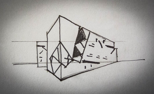
Sketch of Libeskind's Jewish Museum in Berlin

The voids in exterior skin, while random, are uninterrupted - as if the angles which form the sharp edges of the building do not exist.  If you flatten out the facade of the building, the sides appear as a continuous surface.  It is difficult to tell where the skin folds into zig-zagging angles, as well as where they would fit in relation to the plan.  It is almost as if Libeskind cut into a continuous strip of paper and then folded it around his plan.

Jewish Museum Elevations
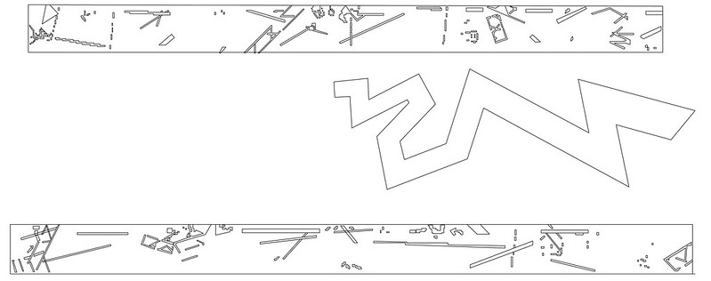
Though punctured, the facade is continuous.

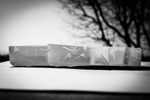
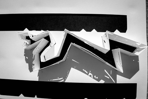
It has been suggested that Libeskind used a loose interpretation of the Star of David, a Jewish symbol, to form the irregular angles of the voids of the museum's skin.  I decided to use light and shadow to further explore this idea in attempt to gain a stronger understanding of the meaning behind the punctures.

Star of David Collage
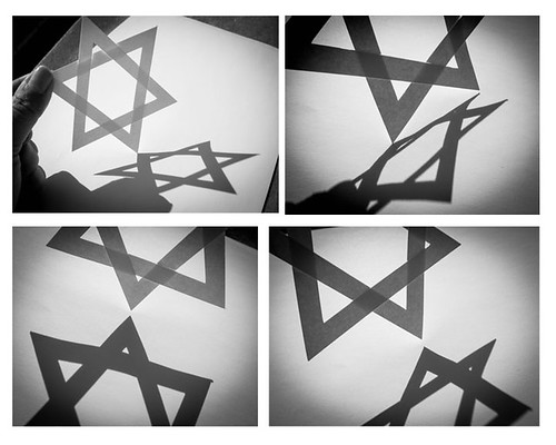
Shadow Study: Star of David

By comparing the shadow produced by the Star of David to the shadow produced by the voids of the museum's facade, I could begin to see how the angles of the cuts of the facades could be construed from angles of the Star of David.  However, I believe that the voids can also serve as a metaphor for the permanent marks left on the Jewish population of Berlin after WWII.  And while the voids appear on the surface of the building as darkness, I couldn't help but notice that the shadows produced by the paper fabrication left exactly the opposite - light - perhaps indicating that even in the darkest of times, even the smallest trace of light can provide a glimmer of hope.

Model Collage
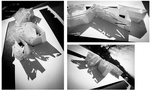
Shadow Study: Libeskind's Jewish Museum

The zig-zagging plan of the building was said to be based upon the deconstruction of the Star of David.  To further understand this method, I used the symmetrical and regular geometry of the Star of David and physically arranged it with the asymmetrical and irregular geometry of the plan of the Jewish Museum.

Collage
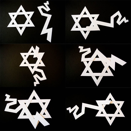
Geometry Study: Star of David v. Jewish Museum Plan

While there may be similar angles and proportions of the Star of David in relation to the plan of the building, most apparent in the sharp angles can provide symbolic meaning to the plan, there may be a stronger relation within the confusion and disorientation the guests must feel in the irregular layout of the museum, similar to how lost and afraid the Jewish population must have felt before, during, and after WWII.

DSC_1178-2

Whether or not the Star of David is visually present in Daniel Libeskind's design of the Jewish Museum in Berlin can really only be determined by the observer.  However, whether or not the user can see the star, I believe it is nearly impossible to ignore the many metaphorical values present in Libeskind's design.  It isn't a building constructed to be beautiful - it's a building constructed to evoke emotion.  And whether that emotion is fear, hatred, confusion, or scorn is simply in the eye of the beholder.